
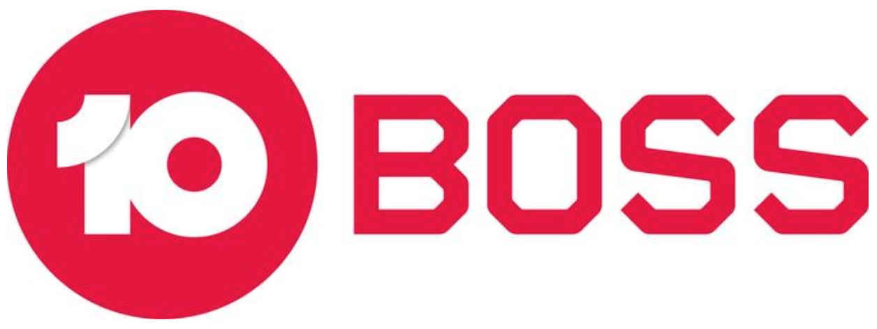
TEN has been forced to update the logo for one of its key mulitichannels’ just days after a network rebranding was announced.
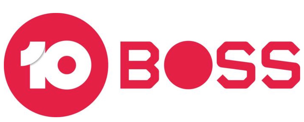
The logo for the rebranded 10 BOSS channel was unveiled last Wednesday night at the network Upfronts event, but by Monday key-eyed viewers began to notice a modification with the letter O becoming a solid round block rather than a traditional letter.
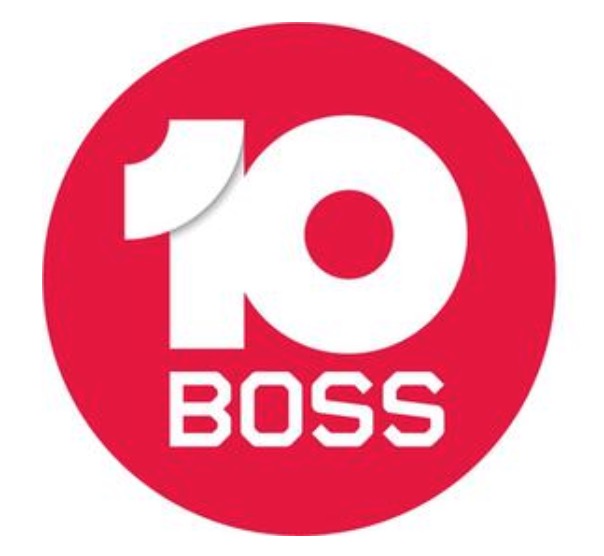
Update: Since the original publication of this article, a third version of the 10 Boss logo has been released featuring the 10 and Boss inside a red circle.
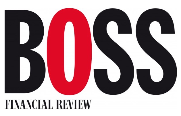
DeciderTV understands the change occurred after an objection was lodged by Fairfax Media, which expressed concerns the new logo was similar to the AFR BOSS logo which the company owns a trademark for and uses for its leadership publications. Fairfax Media is currently seeking approval for a merger with the Nine Network, a key rival of TEN.
A search of the trademark register reveals TEN has lodged a Trademark request for all versions of the new name/logo on Friday 2nd November.
TEN relaunched its multi-channels previously known as ONE and ELEVEN to the new names of 10 BOSS and 10 PEACH last week. The move has generated some criticism from viewers concerned the names are too “Americanised”, while others have been left disappointed at the lack of changes to the programming supplied via the channels.
The networks chief programmer Beverley McGarvey recently told Mediaweek the change allowed the network to be more targeted with its programming, “10 Boss is a little older at 40+ with 10 Peach more 16-39.”
TEN and Fairfax Media have been contacted for comment
Co-Creator and Editor of the TV Blackbox website, Kevin Perry is an experienced media commentator focused on TV Production, Consumer Tech, SVOD & Sports Broadcasting.
GOT A STORY – PLEASE SEND ME YOUR NEWS TIPS
PRIVACY ASSURED
Call/Text – 0428 275 111
Social Media – Twitter – Instagram
News Tips – Direct Message